エルキッズ


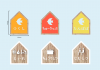


沖縄県の保育園のためのロゴデザインとサインデザインのプロジェクトです。個性やアイデンティティの象徴である太陽と幸福を運ぶ鳥とされているツバメを掛け合わせ、安定感のある円形のロゴデザインとしました。またビタミンカラーである黄色とオレンジを用いることで、子どもたち一人一人が元気で健やかに安心して過ごせる場所のイメージをつくりました。このオレンジのツバメはエルキッズのオリジナルキャラクター「エルバード」としてデザインされています。サインデザインの際は、鳥の巣箱の形をモチーフにし、エルバードが子どもたちを見守っているようなストーリーとしてデザインしました。
This is a logo design and sign design project for a nursery school in Okinawa Prefecture. The sun, which is a symbol of individuality and identity, and the swallow, which is said to be a bird that carries happiness, are crossed to create a stable circular logo design. In addition, by using the vitamin colors yellow and orange, we created an image of a place where each child can spend their time in good health and peace of mind. This orange swallow is designed as Elkids’ original character “Elbird”. When designing the sign, the shape of the birdhouse was used as a motif, and the story was designed as if Elbird was watching over the children.
Type:ロゴデザイン、サインデザイン
Client:株式会社エルサーブ
Creative director:熊田康友
Designer:似内康文
建築設計、建築事業企画・コンサルティング、事業建築のブランディングなどでお困りの方はお気軽にご相談ください。